What is an Effective Call To Action (CTA)?

In our blog we have discussed a lot about how to responsive mailers, sms etc. and grab the attention of audience. But apart from all these actions the very important and basic questions are:
-
What is Call To Action (CTA)?
-
What is the Force Attracting Person to Click on CTA?
ANSWER: Call to action can be defined as an image, text, button that provokes the reader to click on it. So, the name is “call” to take an “action”.
Action can probably be anything like:
- Click to call
- Visit the website
- Get the demo
- Download the eBook
- Avail Coupons
- Join the event/seminar
It is quite necessary to include this option in any kind of promotional sms to prompt the readers to respond. It is an essential part of inbound marketing or permission marketing to convert the audience into a lead by triggering the conversation action.
There are certain special events when you may insert more than one CTA button in your mailer or website page or anywhere you need it to. But keep it limited as repeating it time to time will lose the relevance. Make sure to keep your CTA’s respond with a single click instead of using multiple reference links which irritated the reader wandering all over the Internet space.
What is an effective CTA?
Now we know what CTA is but what else you may add to make it more attractive and prompt the users to click on it.
-
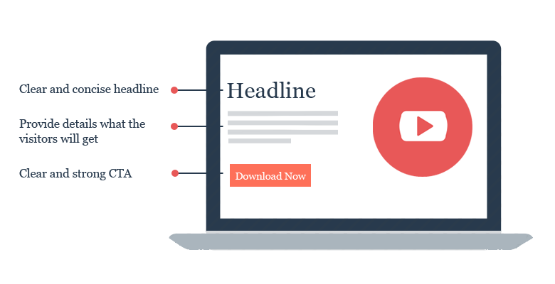
Eye Catching Design
Create a design where the CTA must be clearly visible. Do not let your audience search for the call to action button. It must be loud and clear.

-
Use a phrase/verb
Instead of using a single button one may also use an attractive verb or phrase that will initiate the prompt action.
-
Make it look beneficial and worth clicking
You may use this option to provide the coupon to your clients or to offer them a fair deal of discounts.
-
Let them try the demo
Keep the option of “TRY DEMO” or “Create Demo” or “Use Demo” in your mailer and give a straight link.
-
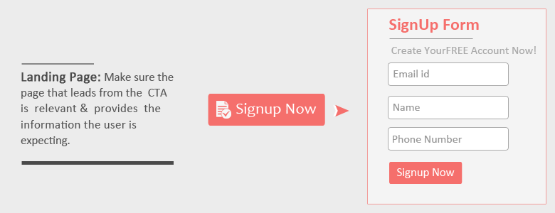
Land on correct page
Let your audience or users go to the option in one single click instead of landing them on random pages.
-
Avoid forcing your users
Certain websites give a CTA option where they do not allow to enter the website without entering the email address. Avoid it.
-
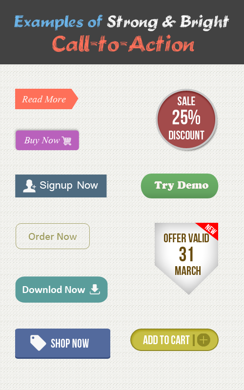
Show urgency in your language
Use the terms like
- Call
- Subscriber
- Register
- Buy
- Demo
- Donate
- Read more
- Order now
To create the sense of urgency you may also use certain phrases like
- Offer valid till 31st march
- Order now and get assured coupon/gift
- For a limited time
- Order before the store run out of stock
-
Right position and Proper space
Keep your action button at a right place so that it is visible easily and should be center of attraction. Along with the alignment it is necessary to keep your CTA alone with a lot of space around it. This will highlight it.
This is all how you may make your website, mailer more attractive and responsive. This is the best option to get more order if used the right way and intelligently. So, better start learning it and applying the key actions to grow your business.
In our blog we have discussed a lot about how to responsive mailers, sms etc. and grab the attention of audience. But apart from all these actions the very important and basic questions are:
-
What is Call To Action (CTA)?
-
What is the Force Attracting Person to Click on CTA?
ANSWER: Call to action can be defined as an image, text, button that provokes the reader to click on it. So, the name is “call” to take an “action”.
Action can probably be anything like:
- Click to call
- Visit the website
- Get the demo
- Download the eBook
- Avail Coupons
- Join the event/seminar
It is quite necessary to include this option in any kind of promotional sms to prompt the readers to respond. It is an essential part of inbound marketing or permission marketing to convert the audience into a lead by triggering the conversation action.
There are certain special events when you may insert more than one CTA button in your mailer or website page or anywhere you need it to. But keep it limited as repeating it time to time will lose the relevance. Make sure to keep your CTA’s respond with a single click instead of using multiple reference links which irritated the reader wandering all over the Internet space.
What is an effective CTA?
Now we know what CTA is but what else you may add to make it more attractive and prompt the users to click on it.
-
Eye Catching Design
Create a design where the CTA must be clearly visible. Do not let your audience search for the call to action button. It must be loud and clear.
-
Use a phrase/verb
Instead of using a single button one may also use an attractive verb or phrase that will initiate the prompt action.
-
Make it look beneficial and worth clicking
You may use this option to provide the coupon to your clients or to offer them a fair deal of discounts.
-
Let them try the demo
Keep the option of “TRY DEMO” or “Create Demo” or “Use Demo” in your mailer and give a straight link.
-
Land on correct page
Let your audience or users go to the option in one single click instead of landing them on random pages.
-
Avoid forcing your users
Certain websites give a CTA option where they do not allow to enter the website without entering the email address. Avoid it.
-
Show urgency in your language
Use the terms like
- Call
- Subscriber
- Register
- Buy
- Demo
- Donate
- Read more
- Order now
To create the sense of urgency you may also use certain phrases like
- Offer valid till 31st march
- Order now and get assured coupon/gift
- For a limited time
- Order before the store run out of stock
-
Right position and Proper space
Keep your action button at a right place so that it is visible easily and should be center of attraction. Along with the alignment it is necessary to keep your CTA alone with a lot of space around it. This will highlight it.
This is all how you may make your website, mailer more attractive and responsive. This is the best option to get more order if used the right way and intelligently. So, better start learning it and applying the key actions to grow your business.